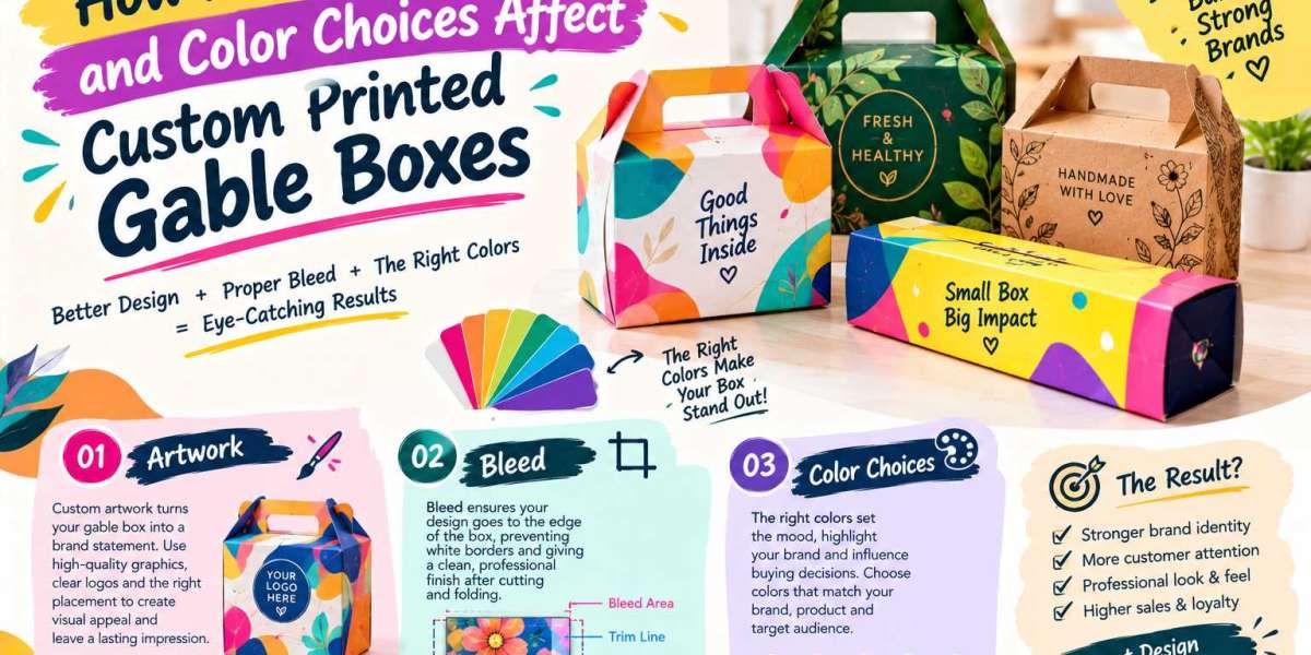
Custom printed gable boxes do more than hold products. They introduce a brand, communicate its personality, and influence how customers perceive the quality of what is inside. Whether used for bakery treats, retail merchandise, corporate gifts, or promotional giveaways, these boxes combine practical packaging with an opportunity to create a memorable visual experience.
However, achieving an attractive result requires more than placing a logo on a box. Artwork placement, bleed settings, and color selection all influence the final appearance of the packaging. Even a small design mistake can affect the overall presentation, while carefully planned printing details can transform an ordinary box into a powerful branding tool.
Understanding how these three elements work together helps businesses create custom printed gable boxes that look professional, remain visually consistent, and reflect their brand identity.
Artwork That Gives Every Gable Box a Distinct Brand Personality
Artwork is often the first element customers notice when they encounter printed packaging. It includes logos, typography, illustrations, product information, decorative patterns, and other visual elements that communicate a brand's message.
For custom printed gable boxes, artwork must be designed with both appearance and packaging structure in mind. Unlike a flat poster, a gable box has multiple panels, folding edges, a built-in handle, and specific areas that become visible when the box is assembled.
Designing Visual Elements Around the Box Structure
A design that looks perfect on a computer screen may not produce the same effect on a finished box. Artwork placed too close to a fold can become distorted, while important text positioned near an edge may appear uneven after assembly.
Designers should consider how the front, sides, back, and top handle will look when the packaging is fully constructed. The main logo can be placed on the most visible front panel, while supporting information and decorative elements can be distributed across the remaining surfaces.
This approach creates a balanced design without making the packaging appear overcrowded. It also ensures that the brand remains recognizable from different viewing angles.
Why High-Quality Artwork Matters More Than Decorative Complexity
Adding more design elements does not automatically make packaging more attractive. In many cases, a simple and well-organized layout creates a stronger impression than a design filled with competing graphics.
High-resolution images, clean vector logos, readable fonts, and consistent spacing help printed gable boxes maintain a polished appearance. Vector artwork is particularly useful for logos and illustrations because it can be resized without losing sharpness.
For businesses targeting premium customers, minimal artwork with carefully selected details can communicate sophistication. Meanwhile, colorful illustrations and playful typography may work better for children's products, confectionery, or seasonal gift packaging.
The most effective artwork is not necessarily the most complicated. It is the design that communicates the right message clearly.
Bleed Settings: The Hidden Detail Behind Clean Printing Edges
Bleed is one of the most important technical considerations in packaging design, even though customers rarely notice it directly. It refers to the extra artwork that extends beyond the final cutting boundary of a printed design.
During production, printed sheets are cut to their intended shape. Small variations can occur during cutting, and without sufficient bleed, these variations may expose thin white edges where the printed color should continue to the edge.
How Proper Bleed Prevents Unwanted White Borders
Imagine a gable box featuring a full red background. If the red artwork ends exactly at the cutting line, even a slight cutting shift could leave a narrow white strip along one side.
Extending the red background beyond the trim line helps prevent this problem. The extra printed area is removed during cutting, leaving the intended color extending neatly to the finished edge.
Bleed requirements vary according to the printer, material, box dimensions, and production method. A bleed of approximately 3 mm is common in many print projects, but the printer's approved dieline and specifications should always take priority.
Understanding the Difference Between Bleed and Safe Zones
Bleed and safe zones serve different purposes, and confusing them can lead to avoidable design errors.
Bleed extends artwork outward beyond the cutting line. A safe zone, on the other hand, keeps important elements such as logos, product names, and legal information away from cutting edges and folds.
Keeping essential content within the safe zone reduces the risk of accidentally trimming important information or placing it too close to an edge.
For custom printed gable boxes, designers should also account for folding areas and handle construction. Text positioned near the handle opening may become difficult to read, while graphics crossing a crease may appear interrupted when the box is assembled.
Why Bleed Accuracy Influences the Final Packaging Quality
Correct bleed settings contribute to a more consistent finish across an entire production run. This matters particularly for businesses ordering hundreds or thousands of boxes, where small visual imperfections can become noticeable when packages are displayed together.
Preparing the artwork with the correct bleed, trim marks, and safe margins helps printers produce cleaner results and reduces the likelihood of costly reprints.
Color Choices That Shape Customer Perception Before the Box Is Opened
Color is more than a decorative feature. It can communicate mood, suggest product quality, support brand recognition, and help packaging stand out in a competitive marketplace.
The right color palette makes custom printed gable boxes visually appealing while ensuring that the packaging remains consistent with the brand's identity.
Matching Packaging Colors With Brand Values
Every brand has a personality, and its packaging colors should reinforce that identity.
For example, soft pastels may suit handmade soaps, wedding favors, and delicate confectionery. Deep navy, charcoal, or restrained metallic accents can create a sophisticated appearance for corporate gifts or premium retail products. Bright yellows, oranges, and greens may be suitable for cheerful promotional packaging or products aimed at younger audiences.
These associations are not universal rules. Customer expectations, cultural context, industry conventions, and the product itself all influence how colors are perceived.
The goal is to choose colors that make sense for the intended audience rather than simply following current design trends.
Creating Contrast Without Overloading the Design
Contrast helps customers distinguish important elements from the background. A logo with strong contrast is generally easier to recognize, while sufficient contrast between text and its background improves readability.
For instance, dark typography on a light background can make product details easy to read. A light logo on a dark-colored gable box can create a striking visual effect when the contrast is strong enough.
However, using too many bright colors, competing patterns, and decorative accents can make packaging look disorganized. A carefully selected primary color, supported by one or two complementary shades, often creates a more cohesive appearance.
Color consistency also matters across different panels. The front of the box should feel connected to the sides and back, rather than looking like separate designs placed on the same package.
Why Screen Colors and Printed Colors May Look Different
One common packaging mistake is assuming that colors displayed on a monitor will look identical when printed. Screens generally use RGB color, which creates colors through light, while many printing processes use CMYK inks or other specialized color systems.
Because these systems reproduce color differently, certain bright digital shades may appear less vivid in print. The final result can also change depending on the paper or board, surface coating, ink characteristics, and printing equipment.
A printed proof or production sample can help identify these differences before a large order is approved. For brands that rely on consistent signature colors, approved color references and suitable print specifications are especially valuable.
The Relationship Between Artwork, Bleed, and Color in One Finished Design
Artwork, bleed, and color should not be treated as separate decisions. Each element affects how the others perform during production.
A carefully designed logo may lose its impact if it is placed too close to a fold. A beautiful background color may develop unwanted white edges if the artwork lacks sufficient bleed. Similarly, an attractive color palette may fail to communicate the intended message if the typography and layout are poorly organized.
Building a Design That Works Beyond the Screen
Consider a bakery creating custom printed gable boxes for gift assortments. The business chooses a warm cream background, a dark brown logo, and small illustrated details representing its products.
The artwork establishes a welcoming identity, the color palette supports the bakery's handcrafted image, and correct bleed settings help the background extend cleanly to the cut edges. The logo is positioned within a safe area so it remains visible after folding and assembly.
Each decision supports the others, producing packaging that feels intentional rather than simply decorated.
This same principle applies to retail brands, event organizers, cosmetic businesses, and companies preparing branded gift boxes. A successful design must look appealing in a digital mockup and remain practical throughout the manufacturing process.
Material and Finish Choices Can Change the Printed Appearance
Even well-prepared artwork can produce different visual results on different packaging materials. The surface of the board influences how ink appears, how details are reproduced, and how colors are perceived.
A smooth, coated surface may support crisp graphics and vivid colors, while an uncoated or textured surface can create a softer, more natural appearance. Neither option is automatically better; the right choice depends on the desired brand experience and the product being packaged.
Finishes also influence the final presentation. Matte coatings can create a restrained, contemporary look, whereas gloss finishes may enhance visual vibrancy. Foil stamping and other specialty treatments can add emphasis to selected elements, although they require suitable production preparation and may involve additional costs.
Businesses should consider the interaction between artwork, color, substrate, and finishing before approving a design. A sample is particularly useful when the packaging depends on subtle shades, fine details, or a specific premium effect.
Common Design Mistakes That Can Reduce Packaging Appeal
Small oversights can undermine an otherwise strong packaging concept. Recognizing these problems early helps businesses avoid unnecessary production expenses and disappointing results.
Some of the most common mistakes include:
- Using low-resolution images: Blurry logos and pixelated graphics can make printed packaging appear unprofessional.
- Ignoring the dieline: Artwork designed without accounting for folds, cutouts, and handle placement may become misaligned after assembly.
- Forgetting bleed: Background colors or edge-to-edge graphics may leave unwanted white borders after trimming.
- Choosing weak color contrast: Important information can become difficult to read when text and backgrounds are too similar.
- Overcrowding the panels: Too many visual elements can make the packaging confusing and reduce the impact of the main message.
- Approving colors from a screen alone: Digital previews cannot always predict the exact printed appearance.
- Placing essential text near cutting edges: Product details, logos, and other important information may be compromised during finishing.
Reviewing these details before production can improve print consistency and help ensure that the finished gable boxes match the original design expectations.
A Smarter Pre-Print Checklist for Custom Gable Packaging
Before sending artwork to a packaging supplier, businesses should review the design from both a creative and technical perspective.
A practical pre-print checklist includes:
- Confirm that the artwork matches the supplier's approved box dieline.
- Check that logos, illustrations, and images have suitable resolution.
- Extend background artwork into the required bleed area.
- Keep important text and logos inside the recommended safe zones.
- Verify that fonts, linked images, and other design assets are prepared correctly.
- Confirm the required color mode and any brand-specific color references with the printer.
- Review folds, cutouts, glue areas, and handle positioning.
- Request a proof or physical sample when the project requires close color matching or precise finishing.
- Inspect the final assembled appearance before approving full production.
Following this checklist helps connect creative design decisions with real manufacturing requirements. It also gives businesses a clearer way to communicate expectations to designers and printing partners.
Turning Better Print Decisions Into Stronger Brand Recognition
Custom printed gable boxes offer businesses a valuable opportunity to make their packaging recognizable and memorable. Their built-in handles, distinctive shape, and multiple printable panels provide a useful foundation for combining convenience with brand presentation.
Artwork determines what customers see and how clearly the brand communicates. Bleed helps protect the design from unwanted white edges and trimming variations. Color choices influence visual appeal, readability, and the way the product's identity is expressed.
When these elements are planned together, packaging becomes more than a protective container. It becomes part of the customer's experience, from the first impression to the moment the box is opened.
Businesses that invest time in artwork preparation, accurate bleed settings, thoughtful color selection, and pre-print checks are better positioned to achieve consistent, professional results. The most successful gable box designs are those that balance creative expression with the technical details needed to bring that design to life.
Conclusion
The quality of custom printed gable boxes depends on more than an attractive concept. Artwork must suit the box structure, bleed must accommodate the cutting process, and colors must reproduce effectively on the chosen material.
When these factors work together, the result is packaging that looks polished, communicates a clear brand identity, and supports a positive customer experience. By paying attention to both design and production requirements, businesses can create gable boxes that combine practical functionality with a distinctive visual presence.
Source Link: https://ibexpackaging.com/gable-boxes/